WebPremium Verified

Event Bar Chart UI Block

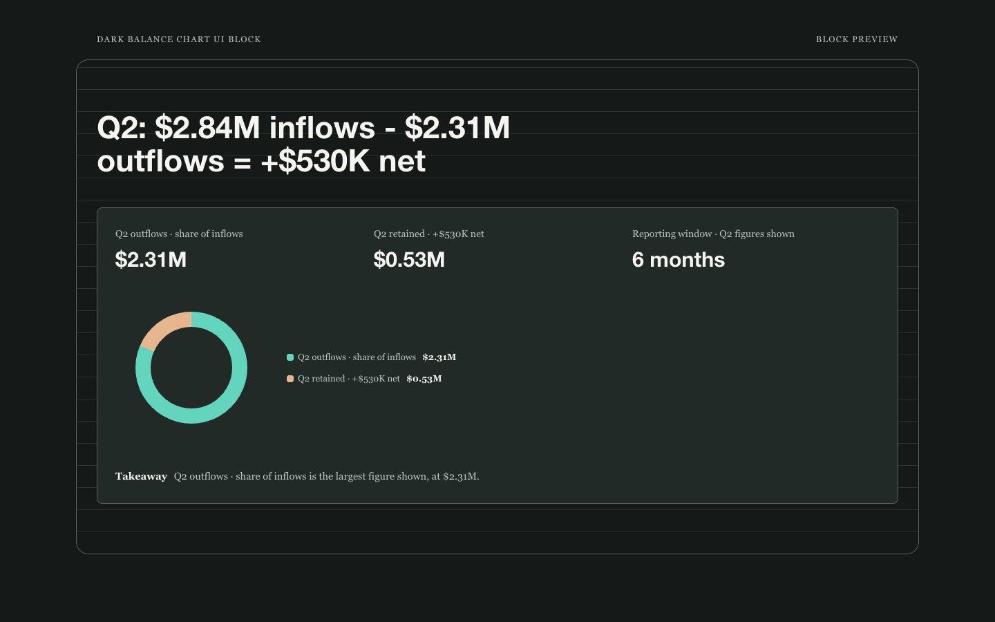
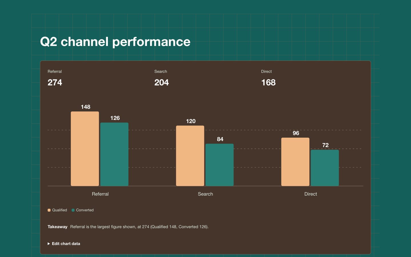
A reusable event comparison chart section with proportional bars, readable direct values, period context, and a concise takeaway for product pages and reports.

What you get

  • A single responsive chart section with a clear title and reporting period.
  • Editable event labels and values shown with proportional bars.
  • A concise takeaway that explains the key comparison.
  • Warm paper styling with restrained teal and clay emphasis.

Good fit

  • Comparing a short list of campaign, product, or research events.
  • Embedding a focused data story in a report or web page.

Not for

  • Large datasets that need filtering, pagination, or complex axes.
  • Values that are speculative or lack a meaningful shared scale.

What you provide

  • Event labels and numeric values with units if applicable.
  • Chart title and reporting period.

Requirements

  • A modern browser
  • Node.js 20+ for the validator

Running cost

No external services. Runs entirely on your agent.

Try this prompt

/sl-event-bar-chart-ui-block Create a warm-neutral April campaign events section for a client report, showing four fictional event counts: Product page visits, 1,284; Guide downloads, 846; Demo requests, 612; Newsletter signups, 438. Keep the teal-bar chart style.

Follow-up prompts

  • Add a benchmark marker for the monthly target while preserving readable value labels.
  • Reorder these events chronologically and rewrite the takeaway for an executive audience.

Verification

Verified

render-checkpass4.0 / 566s

FAQ

Can I change the event labels and values?

Yes. Keep labels, values, units, and the optional takeaway as editable content so the block can be reused with new reporting data.

How many events should the chart show?

Use three to six categories for a quick comparison. For more categories, choose a denser data-table or dashboard pattern instead.

Similar skills