WebPremium Verified

Paired Column Chart UI Block

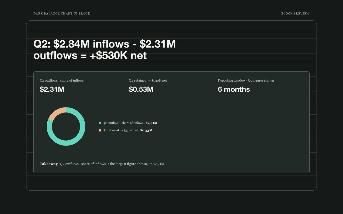
A reusable paired-column chart section for comparing two measures across a handful of categories. Warm dark-clay surfaces, teal and clay bars, and clear labels make it suitable for executive reports and polished product pages.

What you get

  • One responsive chart section with two clearly named series
  • Shared zero-based scale, category labels, and readable values
  • Editable content separated from chart presentation
  • Accessible labels and a concise data-led takeaway

Good fit

  • Executive summaries comparing current and prior periods
  • Product pages showing two measures across feature groups
  • Marketing reports comparing campaign results by channel

Not for

  • Long time series or dense datasets needing interactive exploration
  • Data with incompatible units or scales that cannot be directly compared

What you provide

  • Two named series with values for matching categories
  • Unit and reporting period for the comparison

Requirements

  • A modern browser
  • Node.js 20+ for the validator

Running cost

No external services. Runs entirely on your agent.

Try this prompt

/sl-paired-column-chart-ui-block Create a Q2 channel performance section for a report, showing three channel stats with qualified and converted counts for Referral, Search, and Direct. Use the heading “Q2 channel performance” and show “Qualified 148 · Converted 126”, “Qualified 120 · Converted 84”, and “Qualified 96 · Converted 72”. Keep the Teal Clay Ledger style.

Follow-up prompts

  • Add a source note and a compact comparison-period label.
  • Check the 390px layout: keep every series name and exact value visible without shrinking SVG text.

Verification

Verified

render-checkpass4.0 / 518s

FAQ

How many categories should the chart contain?

Use three to six categories so paired bars and labels remain scannable. For more categories, choose a denser chart type or provide a separate detail view.

Can the series use different units?

No. A paired-column chart implies direct comparison on one shared scale. Convert to a common unit or use a different visualization.

Will the block work on mobile?

Yes. At narrow widths, each category becomes a row with two horizontal bars and visible, full-size values. The chart must not rely on shrinking SVG text or accessible text alone.

Similar skills

Paired Column Chart UI Block · SkillLoom