 $4.99
$4.99Testimonial Columns UI Block
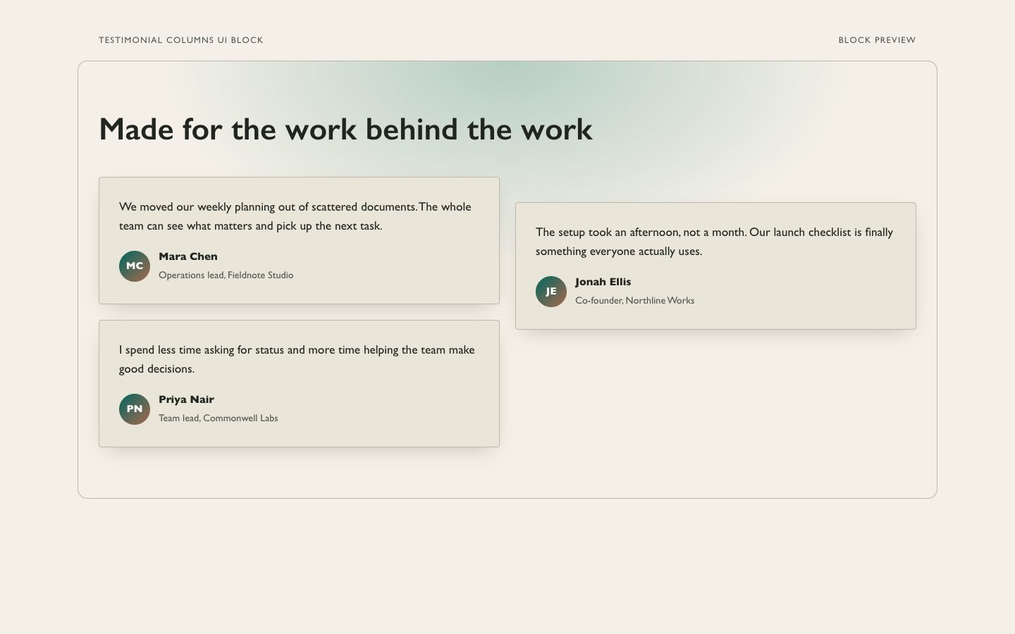
A reusable three-column testimonial section with warm neutral surfaces, restrained teal accents, and a soft generative glow. Designed for polished marketing pages that need credible customer voices.
A responsive, editorial testimonial section with varied quote heights, warm paper surfaces, and restrained teal details. Designed for product launches and marketing pages that need customer proof to feel human and easy to scan.
No external services. Runs entirely on your agent.
/sl-masonry-testimonial-wall-ui-block Create a warm, responsive masonry wall for a fictional project-planning tool titled "Small teams, steadier days". Show three approved small-business testimonials, preserving their wording and attributions. Opening line: "We stopped losing decisions in long message threads." Closing line: "That small change has made handoffs much less stressful." Use Paper Current style and make it mobile-scannable.
Verified
| render-check | pass | 5.0 / 5 | 115s |
No. Provide approved customer statements. The agent can make light length edits only when they preserve the original meaning and approval.
Yes. The layout should collapse to one column while keeping the source order and readable attribution.
Yes. The block uses editable CSS values; keep text contrast and the warm paper foundation intact.
Create a responsive testimonial wall that makes customer voices easy to scan and easy to trust.
Style: Paper Current. Warm paper tones and quiet teal give varied customer voices an editorial rhythm without making the section feel decorative or overly polished. Follow references/style-guide.md exactly.
If something essential is missing, ask one short question before starting. Never invent facts, numbers, quotes or customer names; mark gaps as [needs source].
references/section-library.md. Confirm which block the user needs and where it will live (plain HTML or a framework component).references/template.html to section.html. Keep the <style> block and the one focal section; delete every other section.references/style-guide.md in the :root block. Do not introduce colors, fonts or radii outside the tokens.REPLACE_ placeholder, inside the word limits. Never invent customer names, logos or numbers; label fictional testimonials and figures as sample content.references/framework-adaptation.md after the HTML version passes. ``bash node scripts/validate-html.mjs section.html ``
file://) and check keyboard focus, the FAQ toggles and the mobile menu.section.html: one self-contained HTML file (inline CSS, inline SVG, no network requests, no storage APIs) that opens from file://.<h1>, labelled form inputs, alt text on every image, no REPLACE_ placeholders or filler text.The preview (preview/demo.html) is a static reference built from sample content: it shows the layout, style, copy structure and the visible controls every interactive part needs (labelled form fields, carousel buttons, player chrome). Image areas are labelled placeholders and sample quotes or figures are marked as samples. In a real run the agent uses the user's content and assets, wires behaviour (form destinations, media sources, data) and keeps every promise in the output contract above.
$4.99A reusable three-column testimonial section with warm neutral surfaces, restrained teal accents, and a soft generative glow. Designed for polished marketing pages that need credible customer voices.
 $4.99
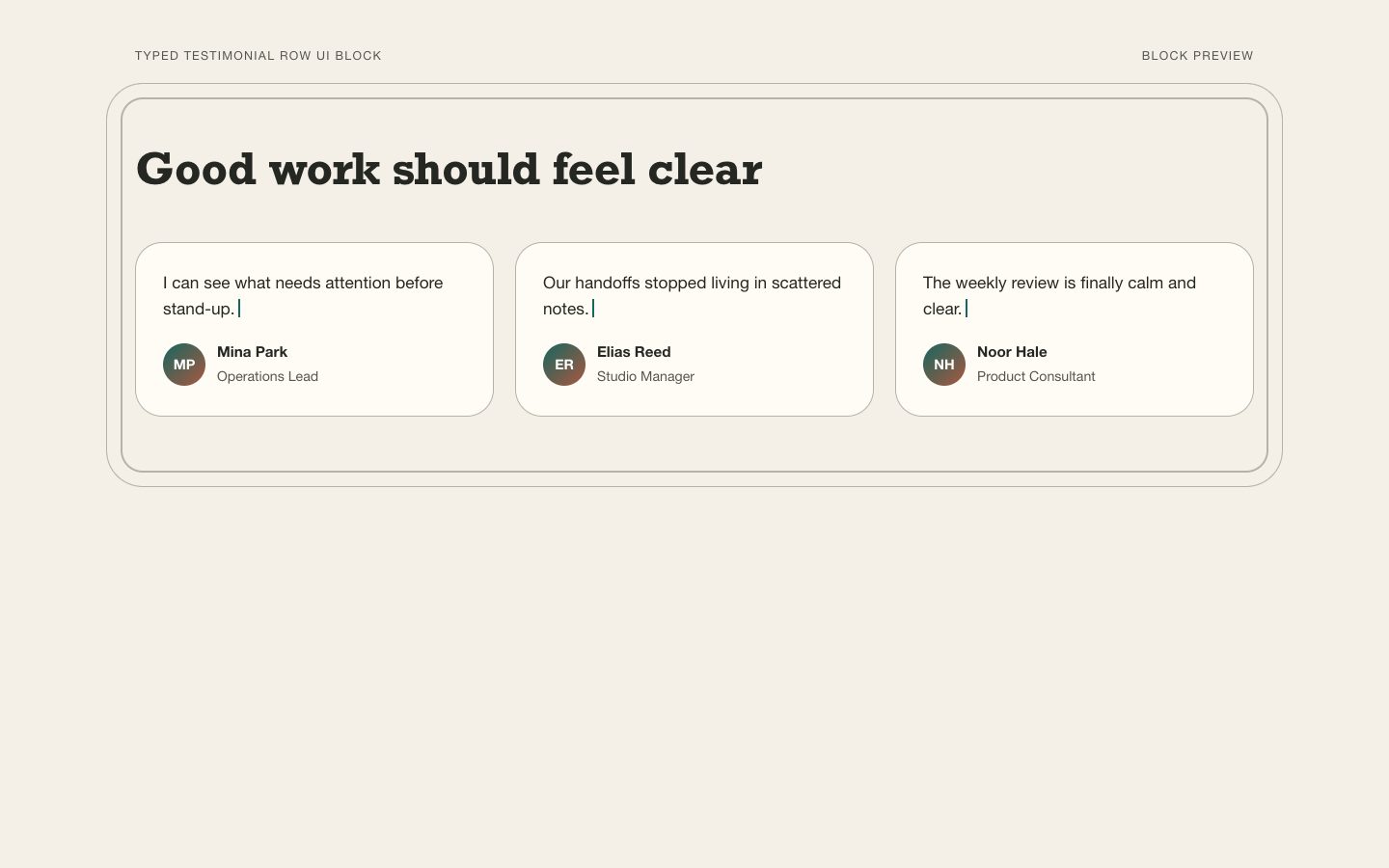
$4.99A polished, editable testimonial row for launch pages and campaigns. Warm paper tones, aligned quote cards, and restrained teal details make real customer voices easy to scan without overstating them.
 $4.99
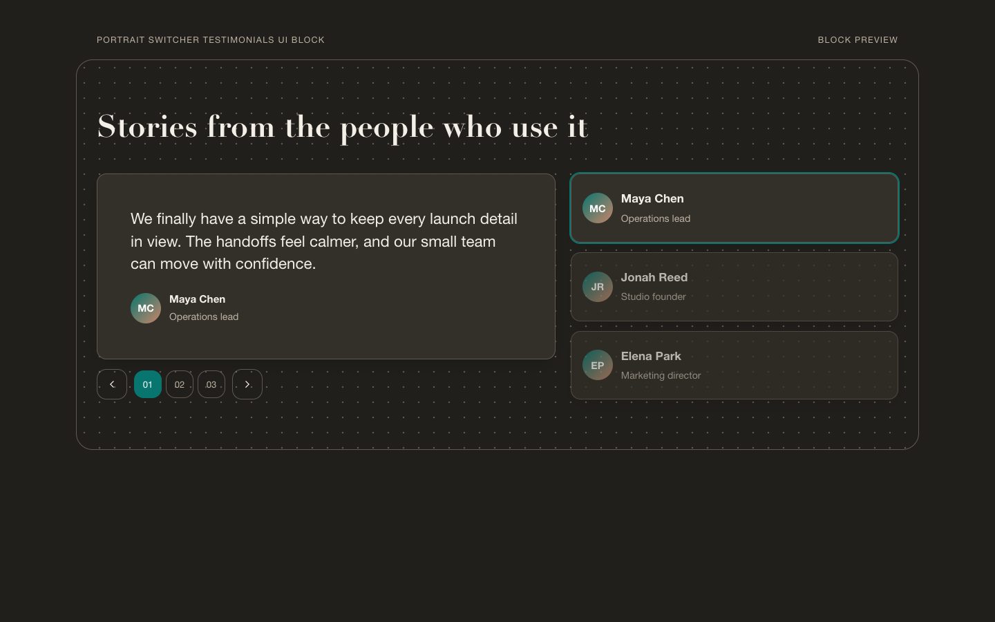
$4.99A reusable marketing testimonial section with an interactive portrait switcher, editorial typography, and warm-neutral surfaces accented in teal. Designed for product launches and campaign pages that need customer proof in a polished, page-ready block.
 $4.99
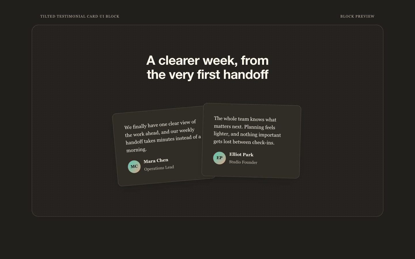
$4.99A reusable, responsive testimonial section with one tactile, slightly tilted paper card, warm-neutral styling, and a restrained teal detail. Made for credible product launches and marketing pages.
 $4.99
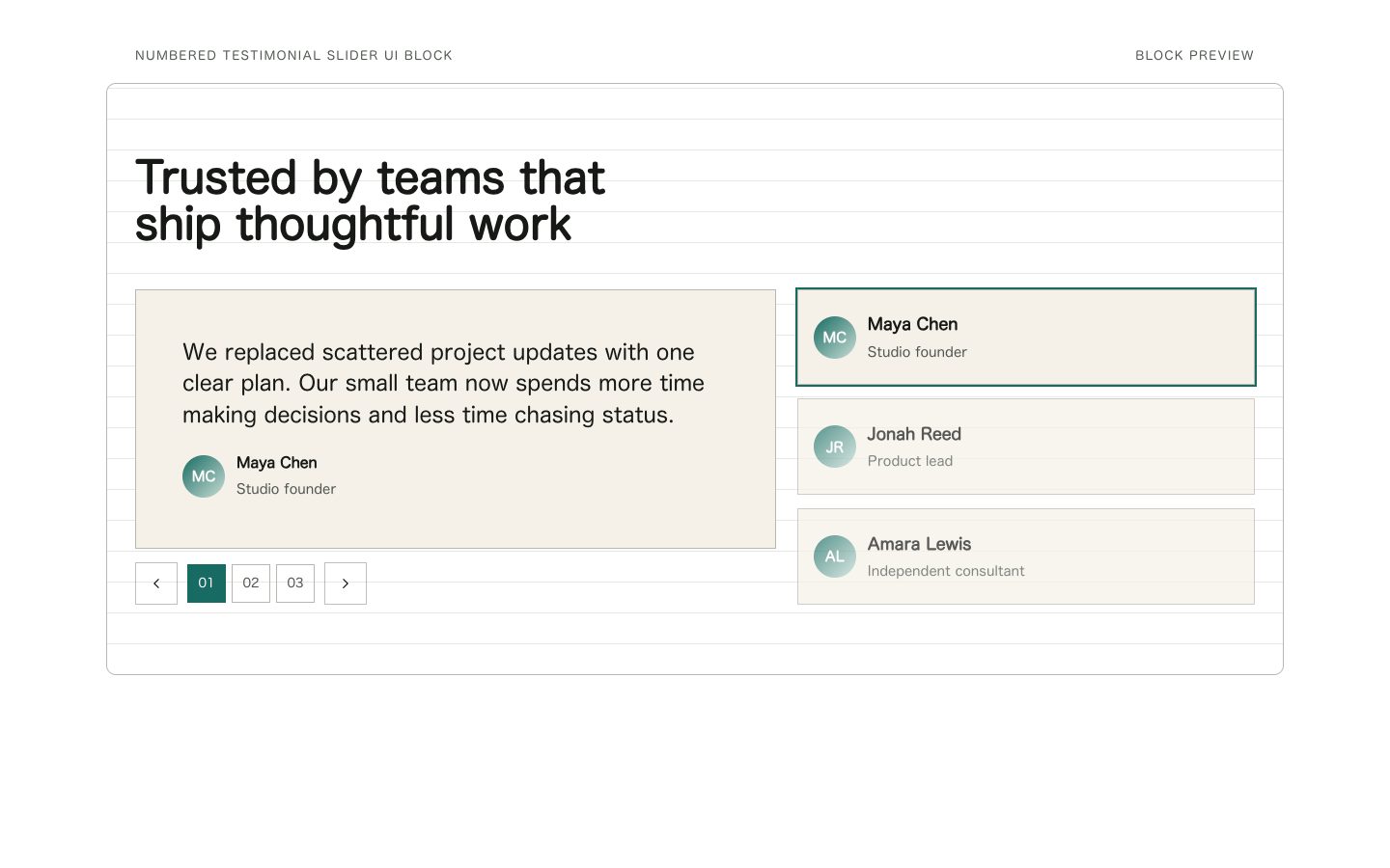
$4.99A polished, reusable testimonial section with numbered slide controls, warm-neutral surfaces, and restrained teal accents. Designed for product launches and marketing pages where customer proof should feel credible, easy to scan, and simple to edit.
 $4.99
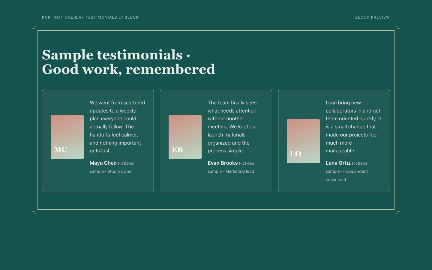
$4.99A reusable testimonial section with offset portrait frames and concise quotes on warm cream panels against a deep teal ground. Its desktop layout uses the available width while preserving a clear mobile reading order.
 $4.99
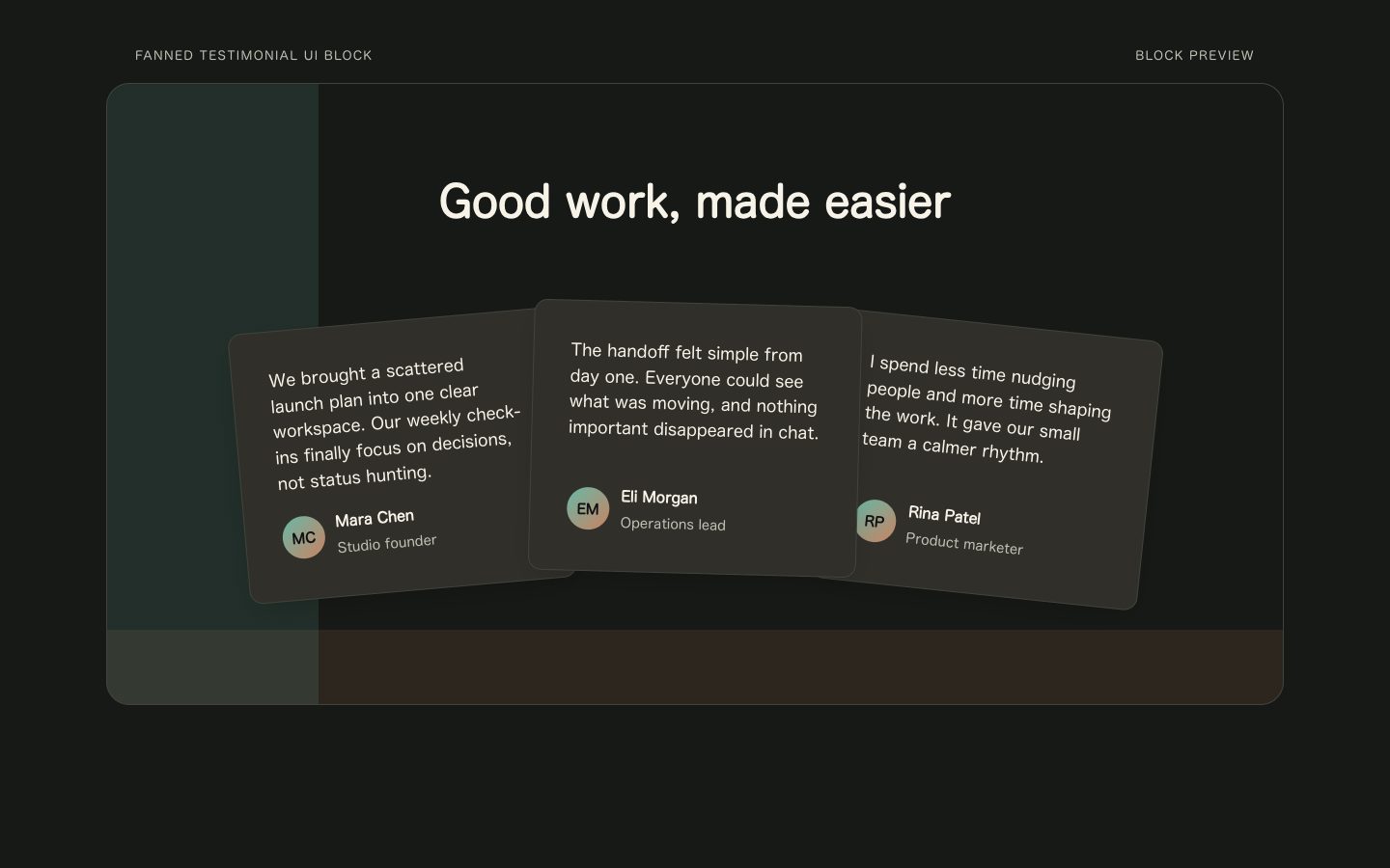
$4.99A reusable testimonial section with warm charcoal cards fanned across an ink-dark canvas and restrained teal accents. Designed for product launches and marketing pages that need social proof with an editorial, human feel.
 $4.99
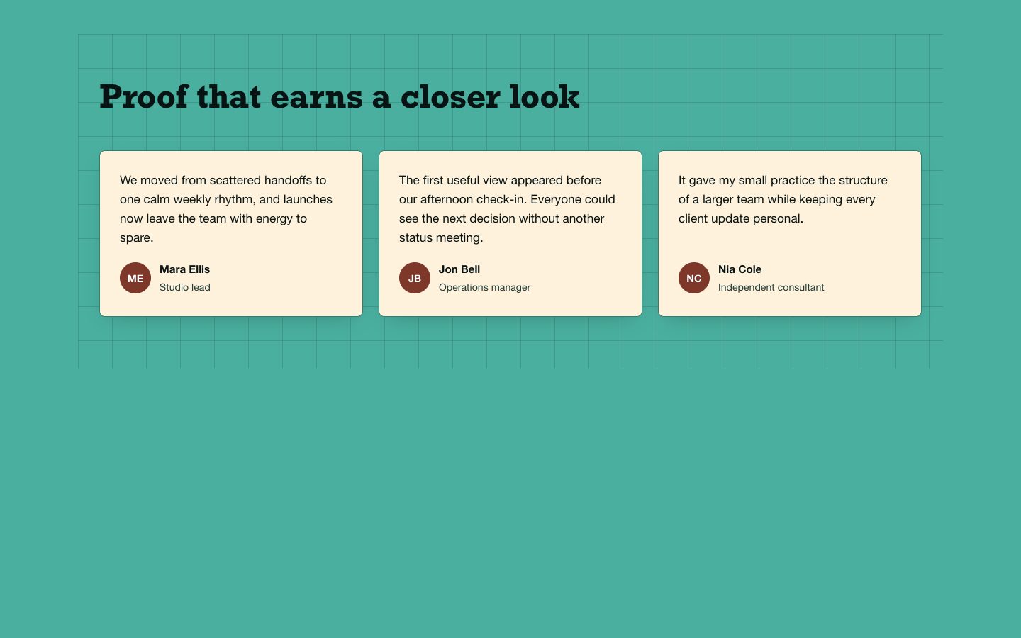
$4.99A reusable testimonial section for launch and campaign pages, arranged as a compact editorial grid on a teal canvas. Cream cards, clear attribution, and restrained clay accents make customer proof easy to scan without adding surrounding page chrome.