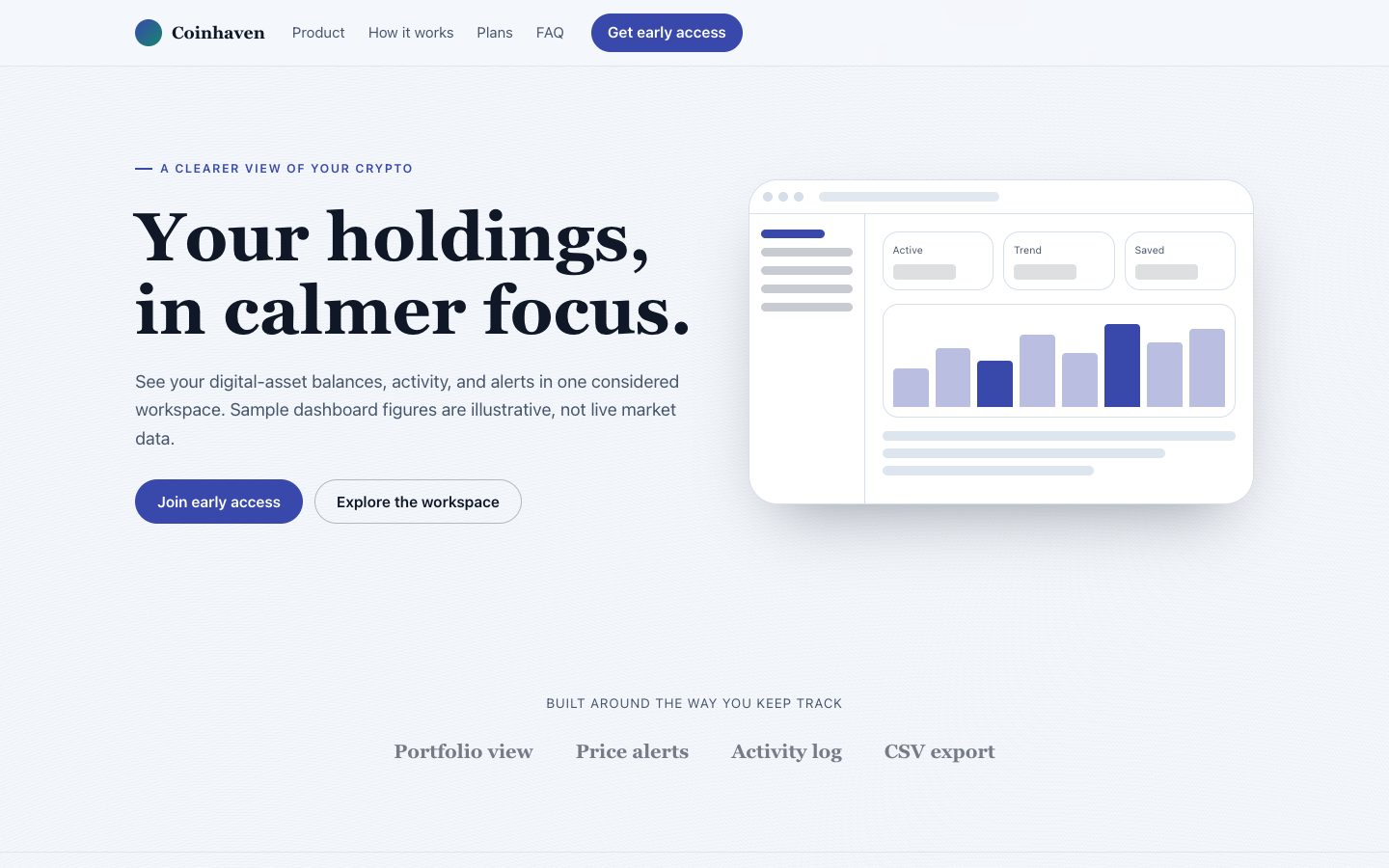
 $4.99
$4.99Coinhaven Crypto Landing Page
A light, dashboard-led launch page for a fictional crypto portfolio workspace, built to explain the product clearly and convert cautious early adopters.
A conversion-focused landing page for Loopwise, a fictional launch operations workspace that helps small product teams turn scattered release work into a calm, visible loop. The page leads with a dashboard hero, credible workflow proof, practical pricing, and a focused trial CTA.
No external services. Runs entirely on your agent.
/sl-loopwise-saas-landing-page Create a responsive Loopwise page for solo founders and small product teams. In order: split hero “Keep every launch moving in one clear loop.”; team logos; four release features; flipped workflow section; four proof stats; four steps; testimonials; three pricing plans; FAQ; footer. Use “Start 14-day trial” as the CTA. Style it with sage and white, slab headlines, 4px corners, and subtle dots.
Verified
| render-check | pass | 4.0 / 5 | 49s |
Yes. Replace the mock metrics, labels, chart values, and activity rows with your own interface details while preserving the hierarchy that makes the product legible at a glance.
Yes. The proof sections can use measured beta signals, planned workflow outcomes, or clearly labeled early-access language instead of invented customer claims.
Yes. The pricing block is structured around editable plan names, prices, billing periods, and feature lists so the commercial model can evolve without redesigning the page.
No. The capability marquee can use lightweight CSS animation with a reduced-motion fallback, keeping the page self-contained and dependable.
$4.99A light, dashboard-led launch page for a fictional crypto portfolio workspace, built to explain the product clearly and convert cautious early adopters.
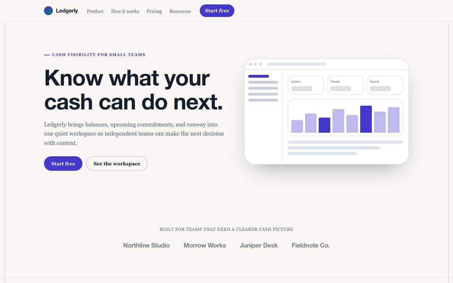 $4.99
$4.99A polished light-first fintech landing page skill for product launches that need a dashboard-led hero, credible operational copy, bento feature storytelling, and a focused conversion path for solo founders and app developers.
 $4.99
$4.99Create a complete launch page for a focused, fictional content management system. The page pairs a light editorial style with a green accent, bordered layouts, flat CMS interface details, and conversion-focused copy that can be edited after generation.
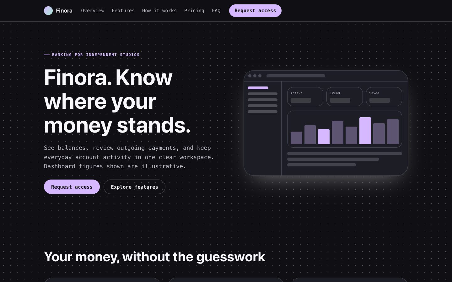 $4.99
$4.99A dark-first banking landing page with an editable account dashboard, precise product copy, clear pricing, and an access-request path. Designed for founders launching a financial product without relying on generic device mockups or unsupported trust claims.
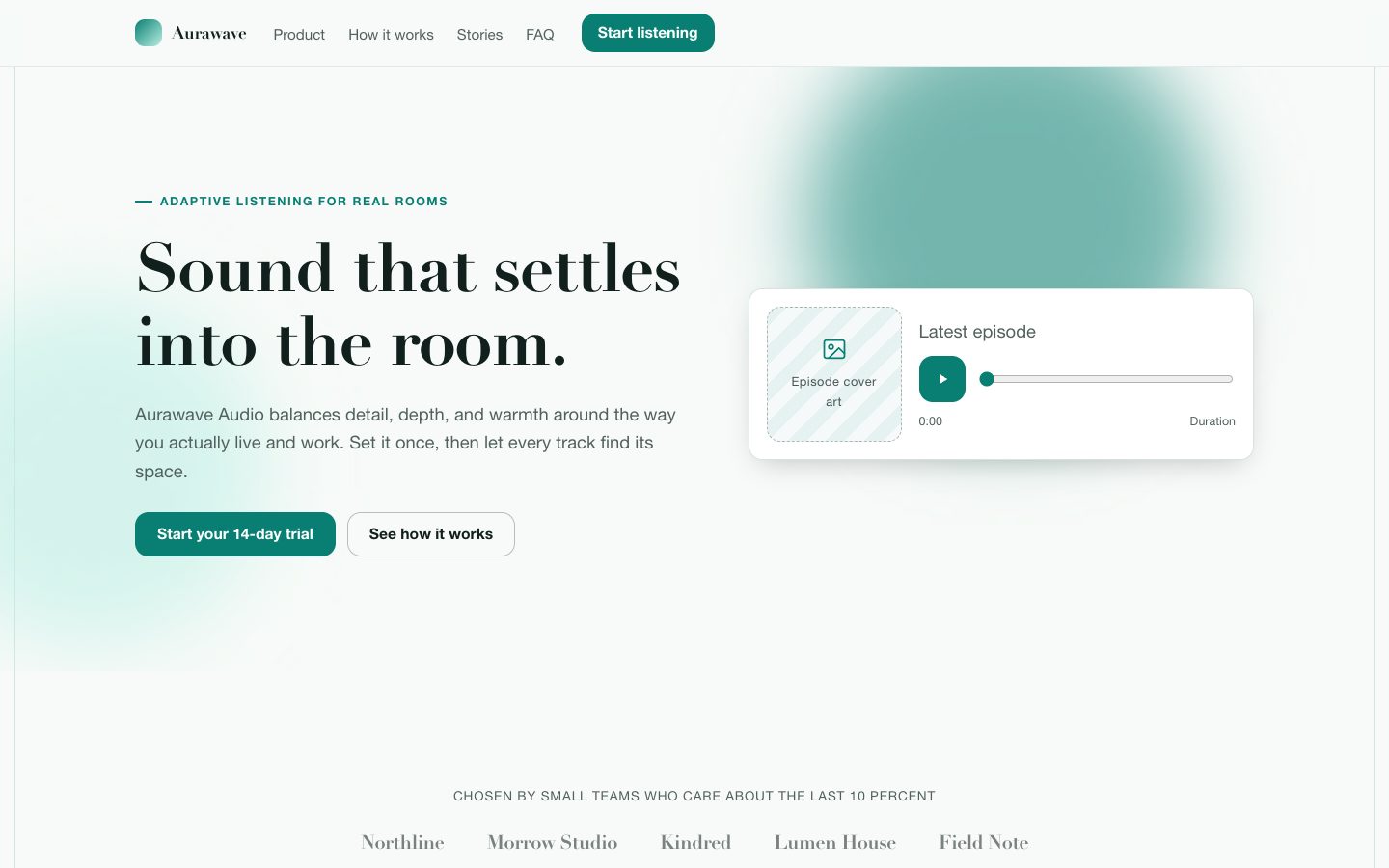 $4.99
$4.99A polished launch-page system for Aurawave Audio, a fictional adaptive listening product that helps people create clear, balanced sound in any room. It combines editorial product photography, focused proof, responsive layouts, and a confident teal accent for conversion-ready publishing.
 $4.99
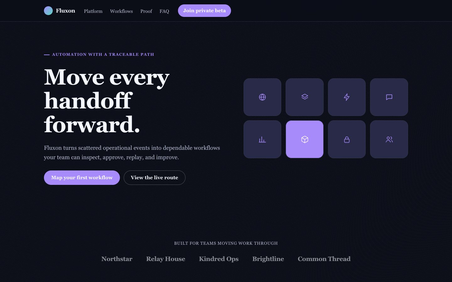
$4.99A paid-quality landing page skill for fictional automation products that need a memorable technical identity. It creates a dark, violet-lit experience with a node-canvas hero, chart panels, proof-driven feature sections, and focused conversion paths for founders launching developer-facing software.
 $4.99
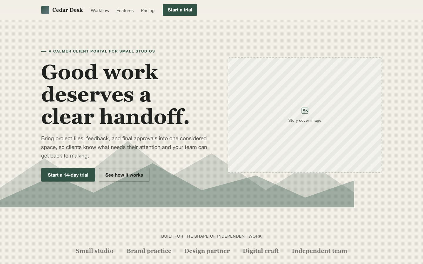
$4.99Create a considered launch page for software with magazine typography, warm paper tones, and clear product storytelling. Made for founders who want a distinctive, editable alternative to generic templates.
 $4.99
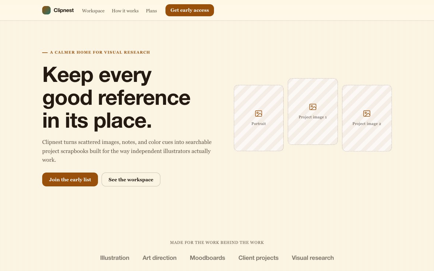
$4.99A distinctive launch page for a fictional creative workspace, styled like a carefully assembled amber scrapbook while staying clear, responsive, and product-focused.