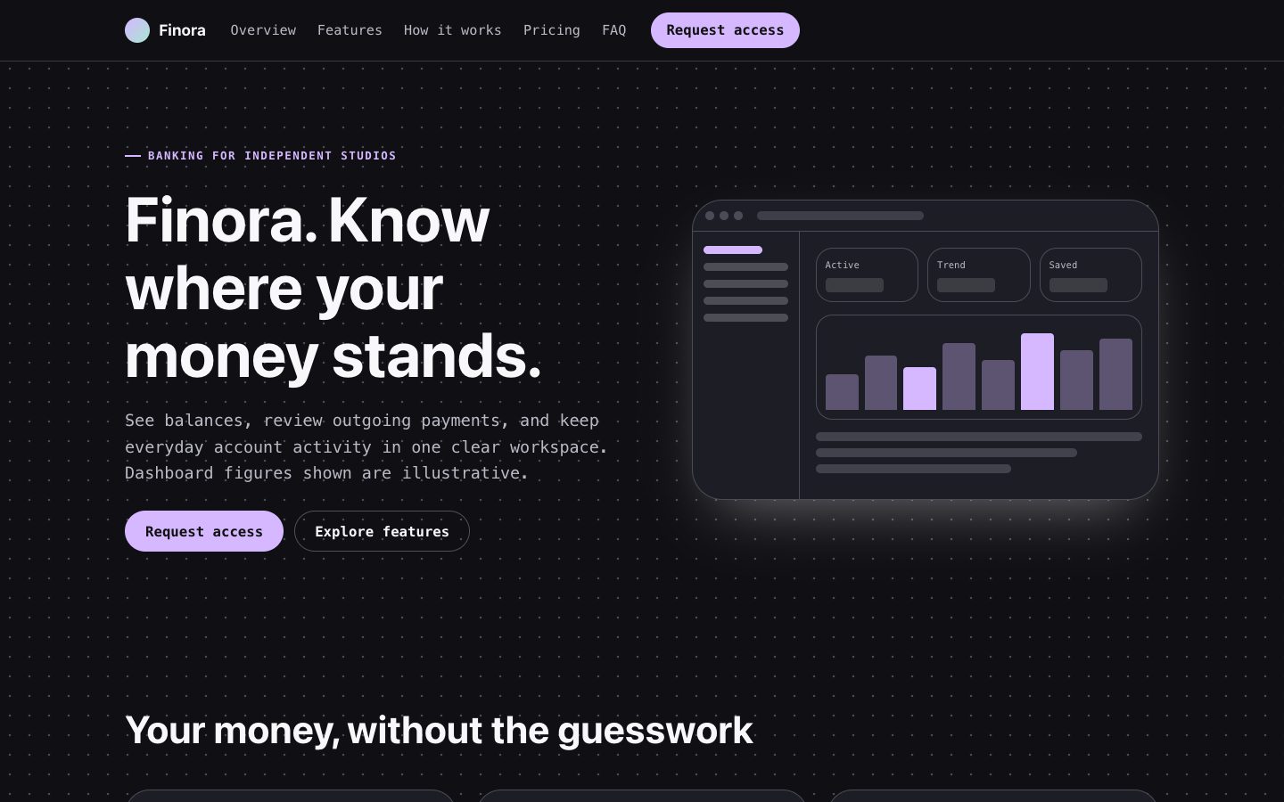
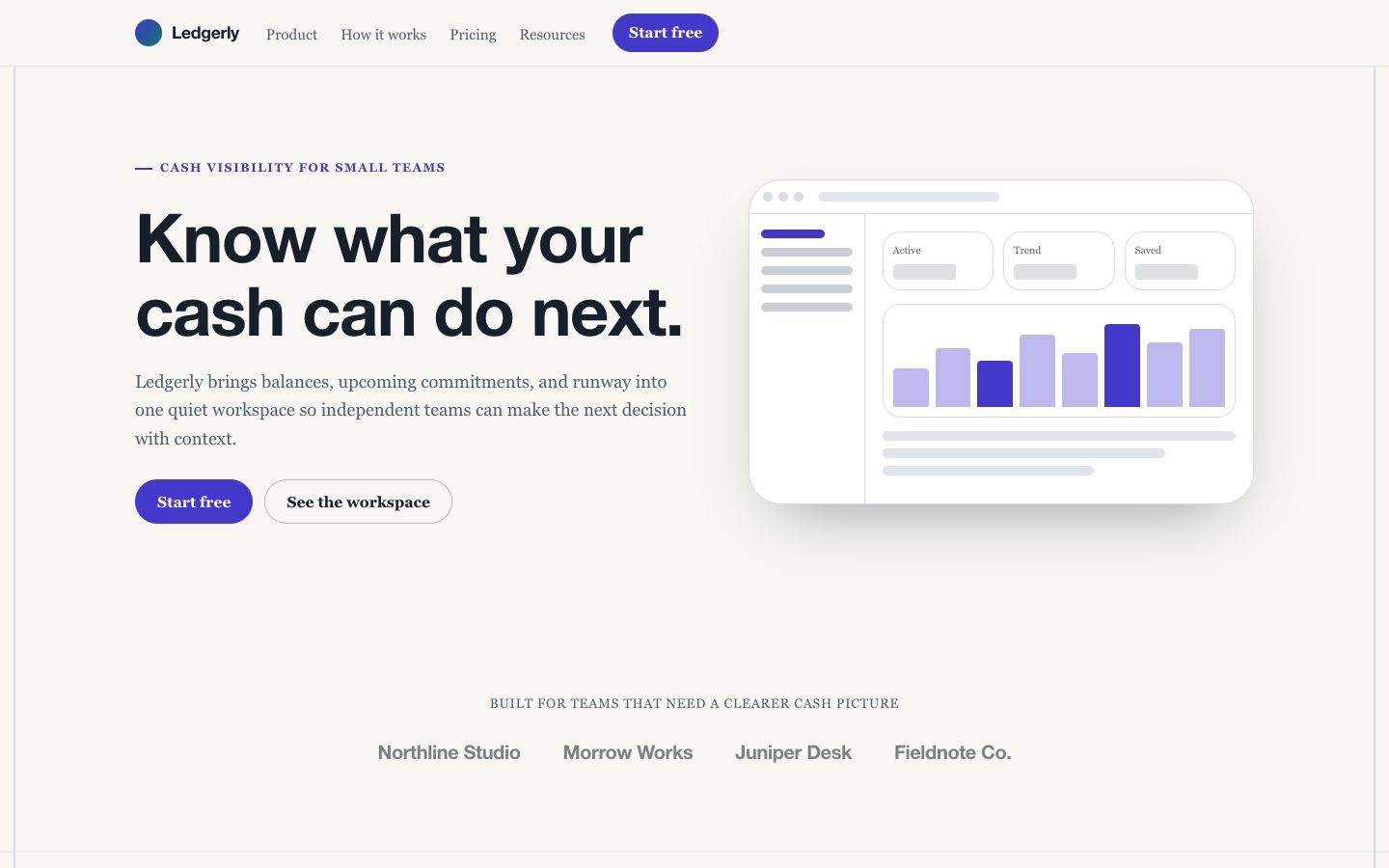
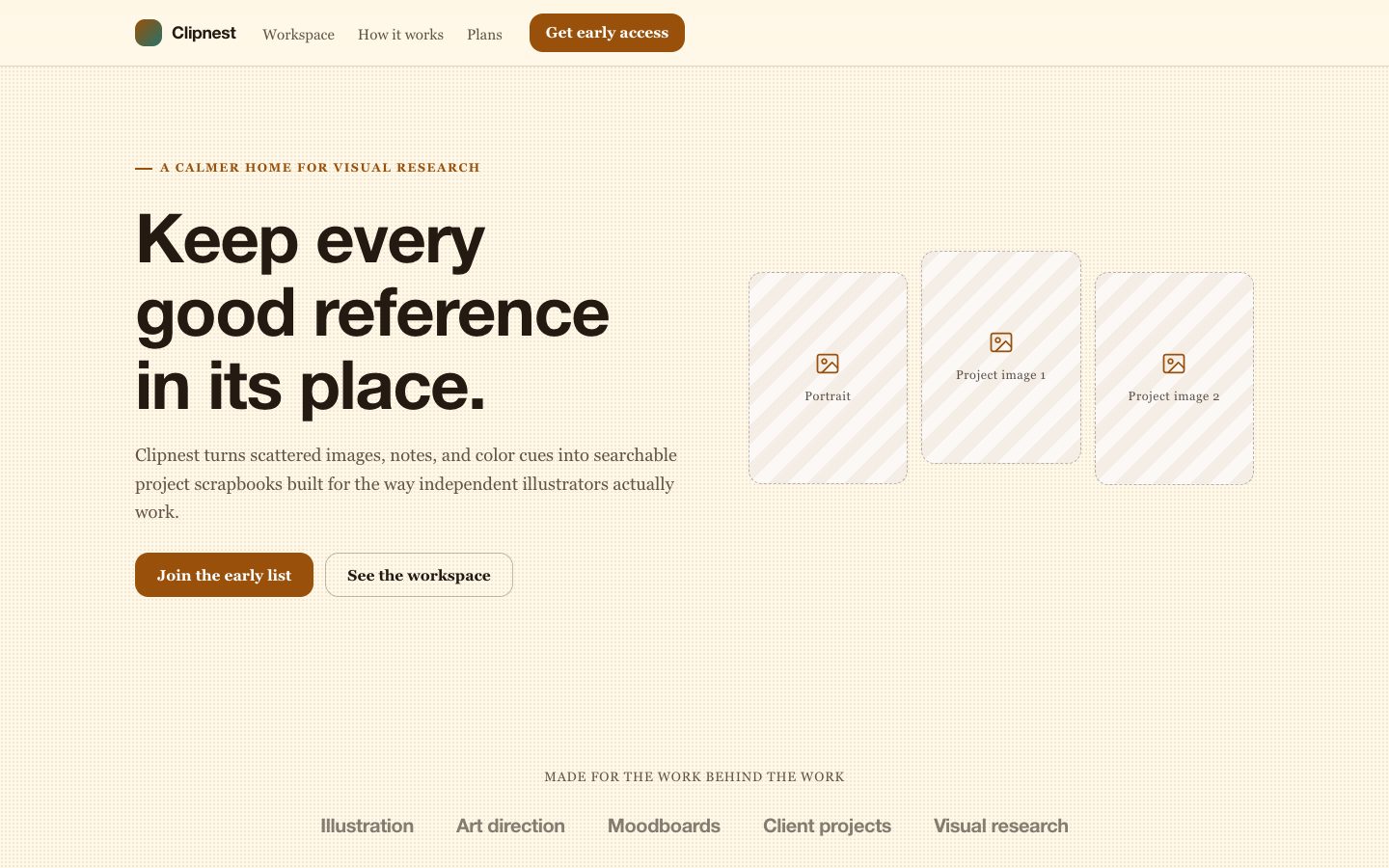
Beacon SaaS Landing Page
Create a complete, responsive landing page for a focused software product, with clear product positioning, believable launch copy, and a quiet dark interface accented by a controlled glow.
Style: Quiet Beacon. A calm, minimal dark canvas gives a practical software product room to feel clear, capable, and quietly distinctive. Follow references/style-guide.md exactly.
Use this skill when
- A solo founder preparing a focused product launch.
- A product manager publishing a concise page for a new software tool.
Do not use
- Multi-page product sites, authenticated application screens, or complex account workflows
- Products that require regulated claims, extensive legal disclosures, or unverified performance promises
- Visual identities that depend on bright light themes, dense ornament, or multiple competing accent colors
- To reproduce another company's brand, logo, product UI or copyrighted characters.
Inputs
- Product name, category, and one-sentence description
- Primary audience and the specific problem the product solves
- Three product capabilities or workflow details to feature
- Launch call to action, destination, and any confirmed pricing
- Optional brand colors, product screenshots, or visual references
If something essential is missing, ask one short question before starting. Never invent facts, numbers, quotes or customer names; mark gaps as [needs source].
Workflow
- Read the brief and
references/section-library.md. List the sections the page needs, in order, before writing any markup. - Copy
references/template.html to index.html. Delete the sections the brief does not need; reorder the rest. - Apply the tokens from
references/style-guide.md in the :root block. Do not introduce colors, fonts or radii outside the tokens. - Write real copy from the user's brief for every
REPLACE_ placeholder, inside the word limits. Never invent customer names, logos or numbers; label fictional testimonials and figures as sample content. - Check the layout at 390px, 768px and 1280px wide: no horizontal scrolling, readable type, tap targets at least 44px.
- If the user works in React/Next.js, Vue or Tailwind, port the result with
references/framework-adaptation.md after the HTML version passes. - Run the validator and fix every problem it reports:
``bash node scripts/validate-html.mjs index.html ``
- Open the file in a browser (from
file://) and check keyboard focus, the FAQ toggles and the mobile menu.
What makes this excellent
- Frame the product around one concrete job the audience needs done; make the hero headline understandable without category jargon.
- Write launch copy for a fictional product using only supplied claims; do not invent customer counts, integrations, security certifications, or performance results.
- Show how the product works through a credible interface or workflow description, with labels and details that match the stated capabilities.
- Keep the page to 8-11 sections, beginning with navigation, using exactly one hero, and ending with the footer.
- Use a single primary action consistently; make secondary actions visually quieter and link them to a specific page destination.
- Make navigation, feature groups, pricing, and FAQ content easy to scan on narrow screens without horizontal overflow.
- If pricing or customer proof was not supplied, use transparent launch-stage language rather than presenting fabricated specifics.
Output contract
index.html: one self-contained HTML file (inline CSS, inline SVG, no network requests, no storage APIs) that opens from file://.- Exactly one
<h1>, labelled form inputs, alt text on every image, no REPLACE_ placeholders or filler text. - Responsive at 390 / 768 / 1280px, using only the style-guide tokens.
- A hand-off note: sections used, any sample content that must be replaced, framework port (if any) and the validator output.
- Deliver a complete responsive page with semantic sections, working navigation anchors, and one clear primary conversion action.
- Keep copy, colors, links, and section content straightforward to edit in the generated HTML or component source.
Reference demo and agent run
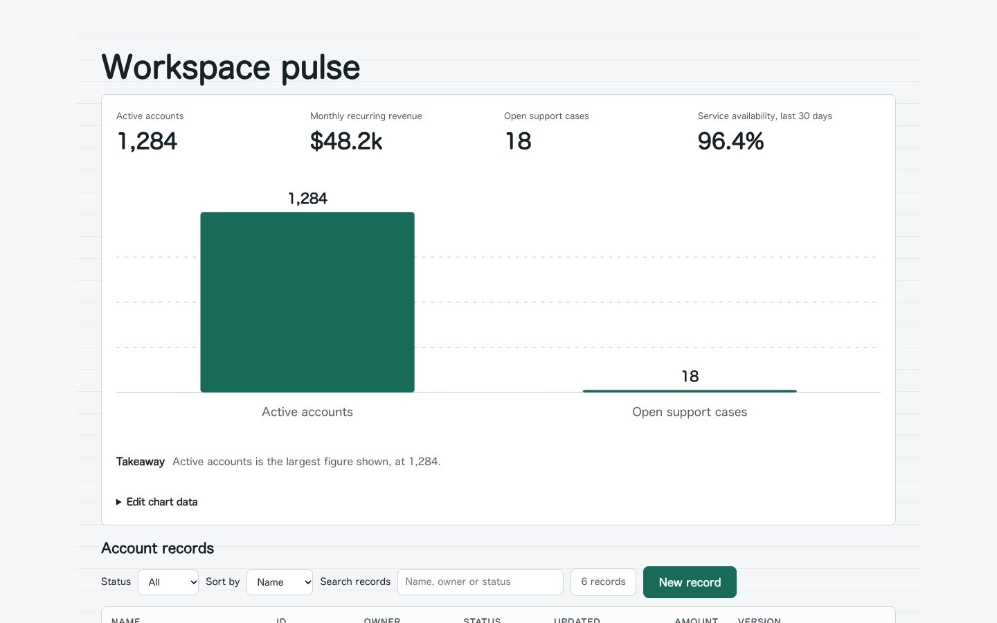
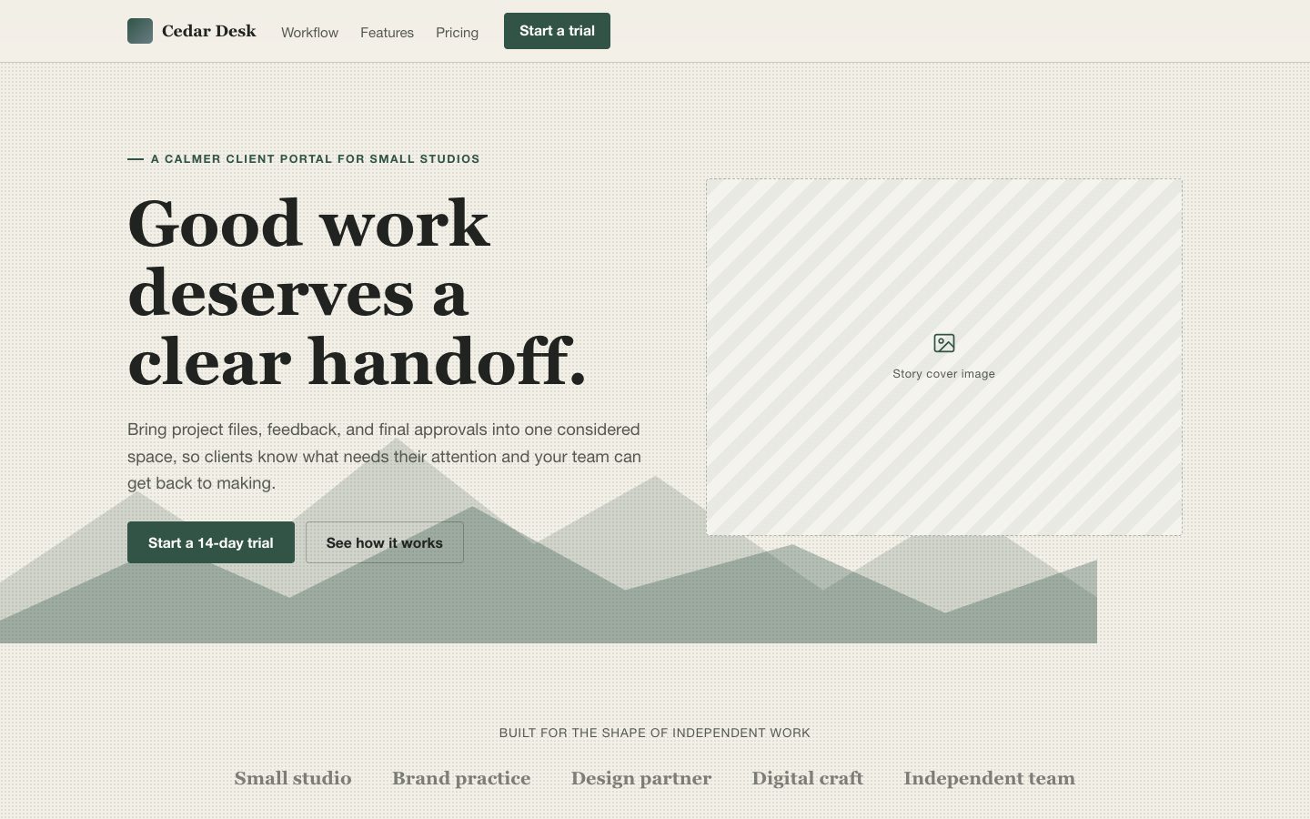
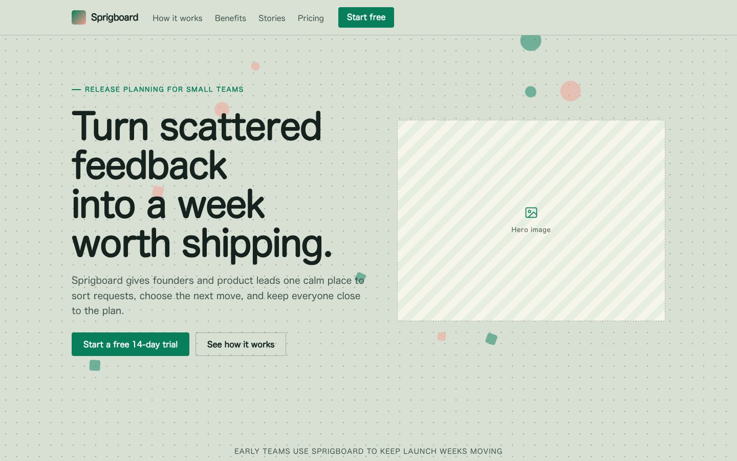
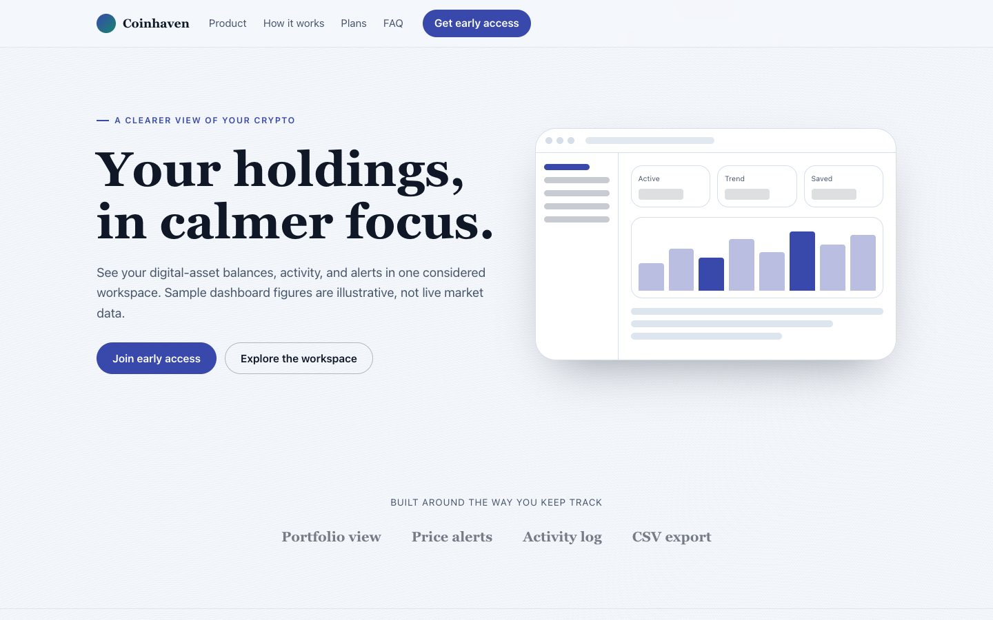
The preview (preview/demo.html) is a static reference built from sample content: it shows the layout, style, copy structure and the visible controls every interactive part needs (labelled form fields, carousel buttons, player chrome). Image areas are labelled placeholders and sample quotes or figures are marked as samples. In a real run the agent uses the user's content and assets, wires behaviour (form destinations, media sources, data) and keeps every promise in the output contract above.
Failure rules
- Never hand over a file that fails the validator; fix it and run it again.
- If the brief lacks facts (prices, numbers, customer names), ask once; otherwise mark them clearly as sample content.
- Do not reproduce another company's website, logo or copy, even if asked to "make it look like" one; build an original page in this style instead.
 $4.99
$4.99