WebPremium Verified

Confetti Marketing Landing Page

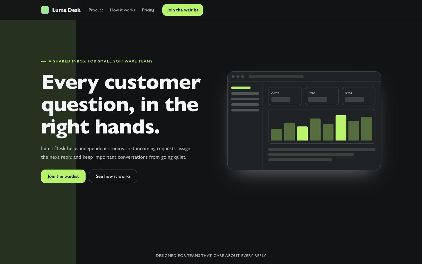
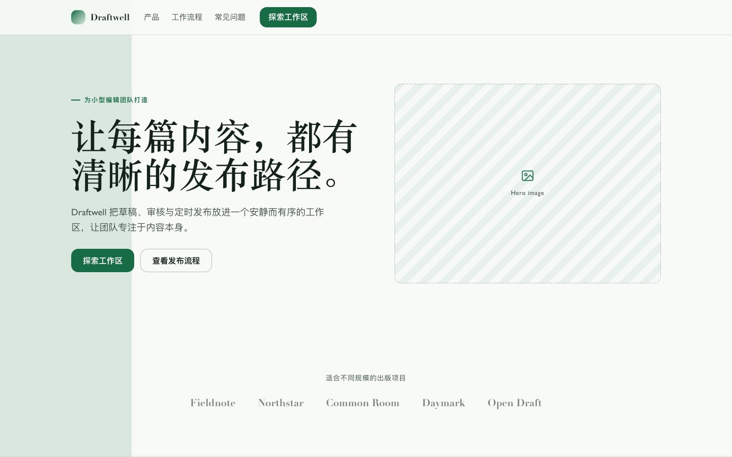
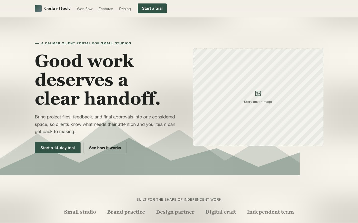
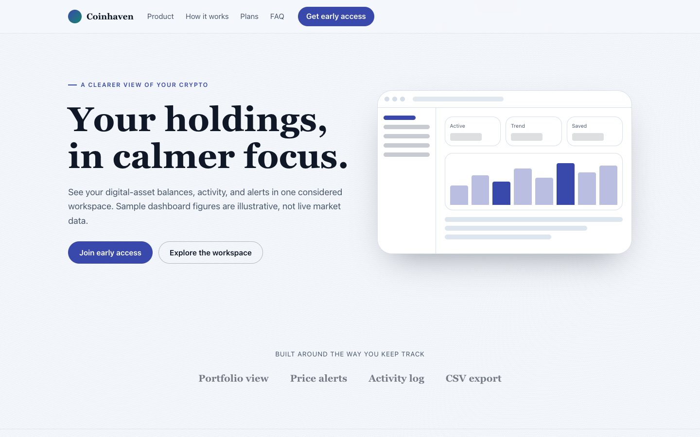
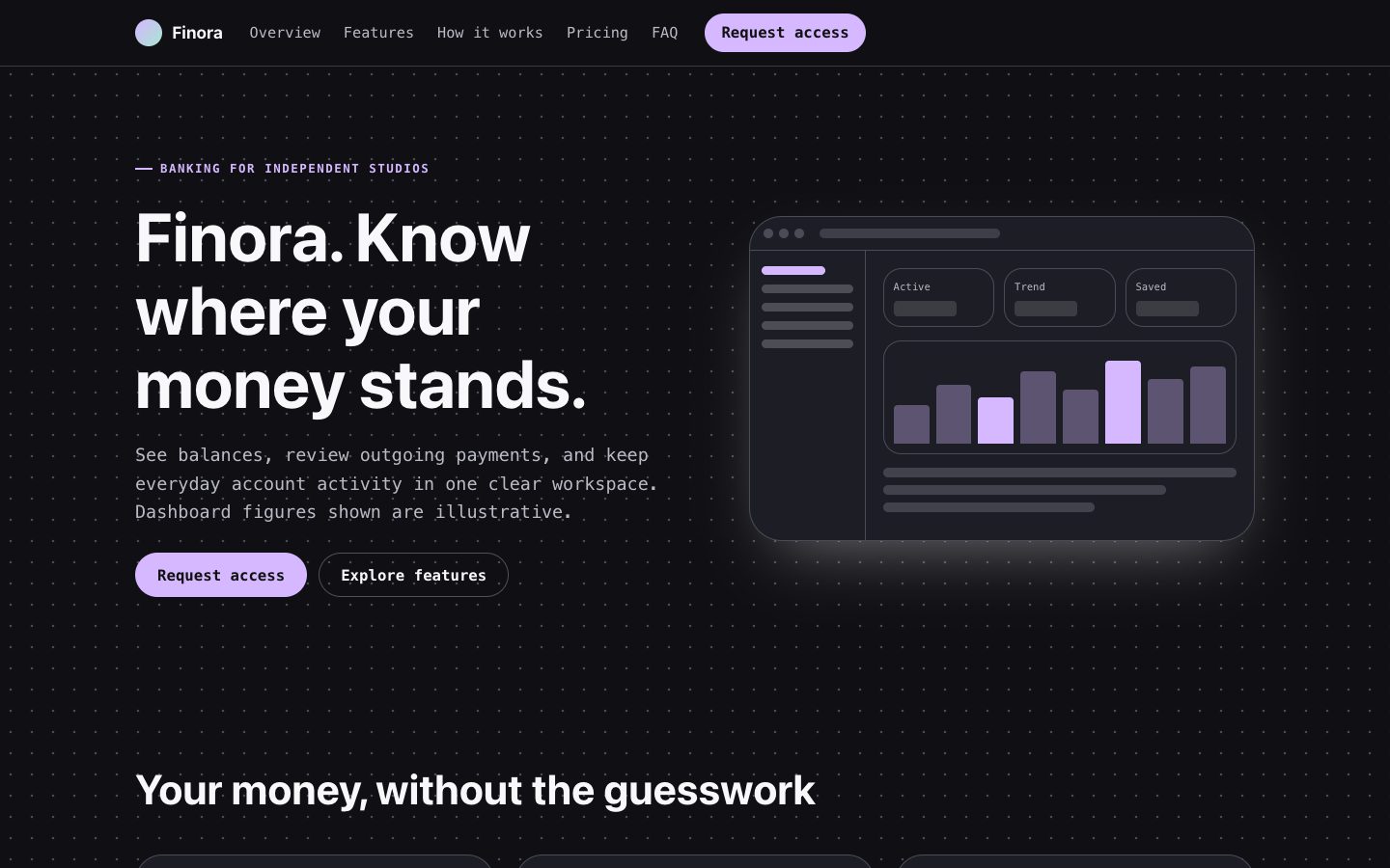
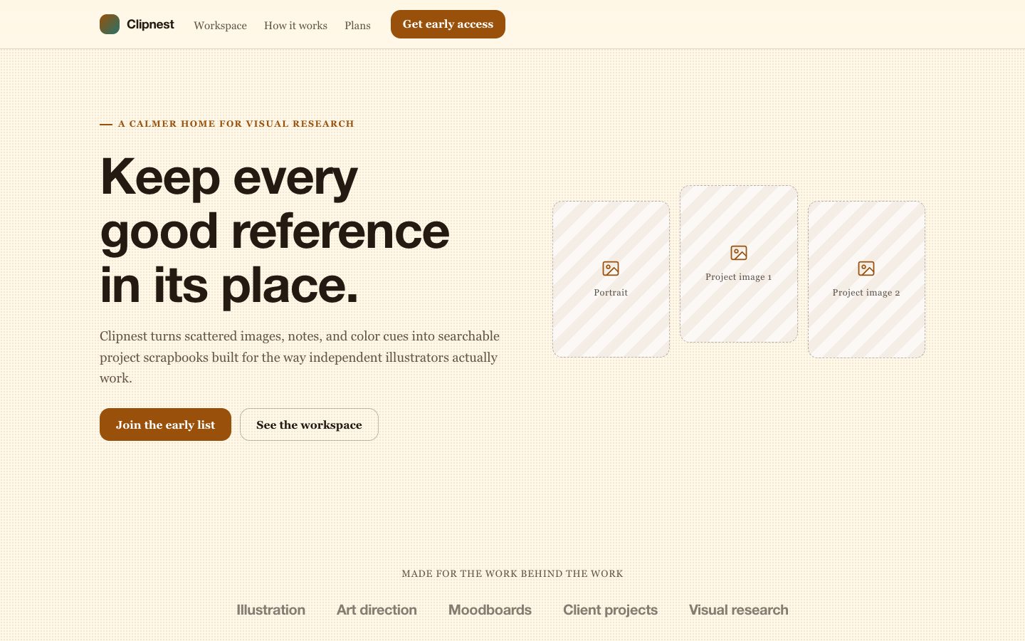
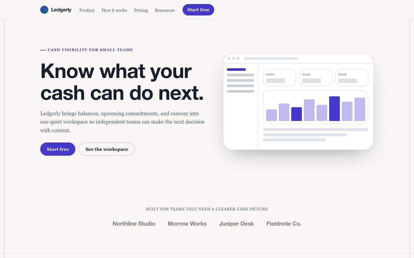
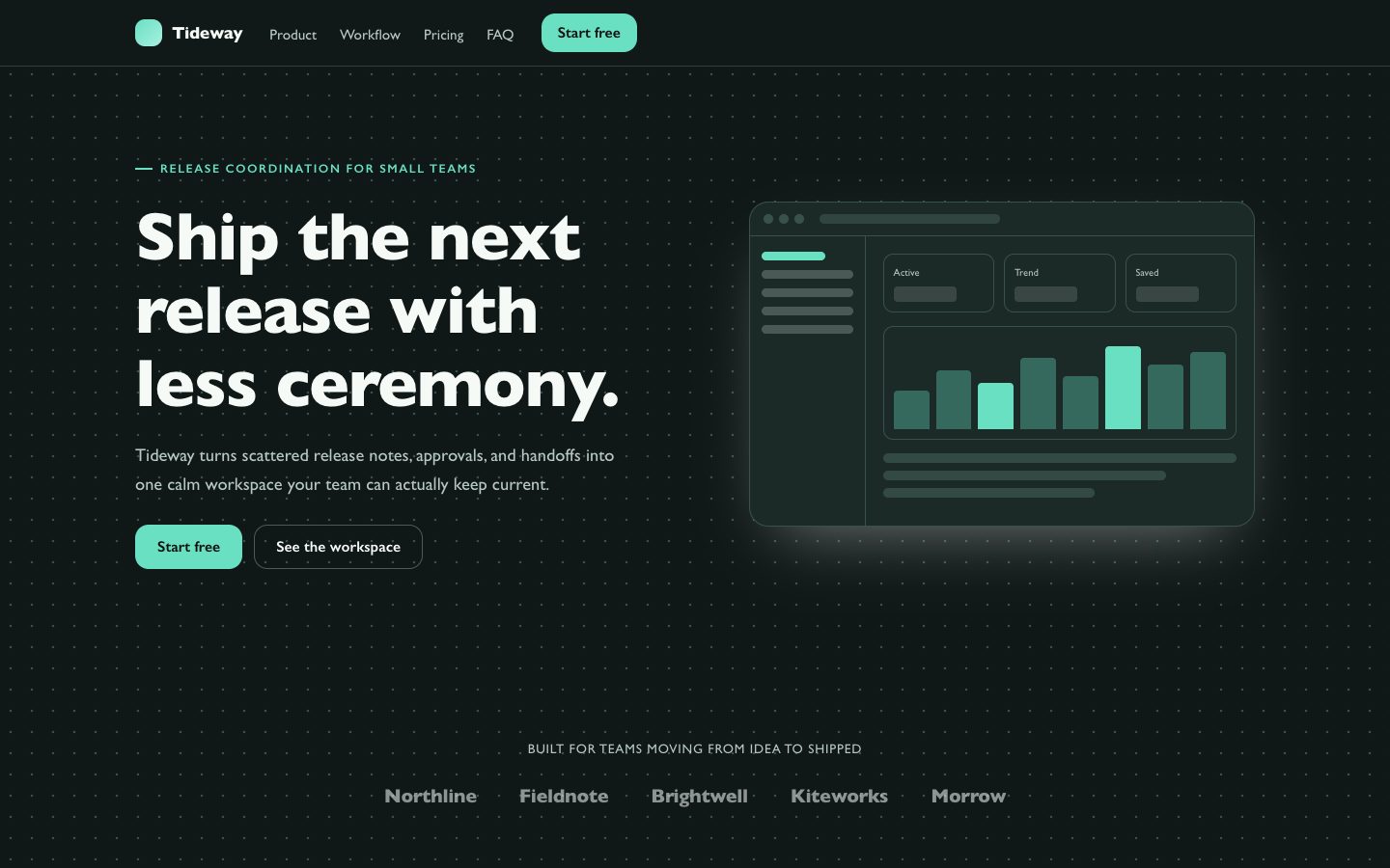
A signature landing-page skill for product launches that combines a dotted paper grid, emerald conversion cues, pastel sticker cards, and rounded type. It helps solo founders and product teams present a fictional software product with clear hierarchy, credible proof, and an editable responsive output.

What you get

  • A complete 10-section launch page with navigation, hero, proof, features, testimonials, FAQ, CTA, and footer
  • A distinctive dotted-paper visual system with emerald actions, coral accents, sticker cards, and soft shadows
  • Specific fictional product copy shaped around audience pain, workflow value, and launch conversion
  • Responsive HTML that can be ported cleanly to React, Vue, or Tailwind without relying on webfonts

Good fit

  • A new software product that needs memorable launch positioning without sacrificing clarity
  • Solo founders and small product teams publishing an editable first marketing page

Not for

  • Formal enterprise pages dominated by compliance content and procurement requirements
  • Products whose brand direction is strictly dark, monochrome, or luxury-minimal

What you provide

  • Product name, category, and one-sentence promise
  • Primary audience and the action the page should drive
  • Three to five real differentiators or workflow outcomes
  • Available proof such as quotes, early metrics, pricing, or launch timing

Requirements

  • A modern browser
  • Node.js 20+ for the validator

Running cost

No external services. Runs entirely on your agent.

Try this prompt

/sl-confetti-marketing-landing-page Create a responsive Sprigboard launch page for solo founders and product leads at small software teams. Show, in order: hero, team logos, three workflow benefits, shared-plan story, three stats, two testimonials, FAQ, CTA, footer. Use “Turn scattered feedback into a week worth shipping.” Close with “Make the next release easier to explain.” and “Start planning free”. Style: dotted paper grid, emerald actions, coral notes, soft shadows.

Follow-up prompts

  • Make the hero more compact and move the strongest metric above the feature grid.
  • Replace the pricing section with an email waitlist while preserving the paper-grid visual system.
  • Add a product walkthrough split section with three annotated workflow states and clearer mobile stacking.

Verification

Verified

render-checkpass4.0 / 567s

FAQ

Can the visual style be adapted to an existing product brand?

Yes. Keep the paper grid, sticker-card logic, and clear hierarchy while exchanging the accent colors, copy tone, and decorative density to fit the product brand.

Does the skill require product screenshots?

No. It can create an editorial product composition with interface-like panels and labeled workflow moments. Real screenshots can be substituted later without changing the section structure.

What makes the page suitable for a paid launch?

The output combines a distinctive art direction with conversion-focused information architecture, believable proof points, responsive behavior, accessible controls, and editable implementation details.

Similar skills

Confetti Marketing Landing Page · SkillLoom